One of my favorite director's of all time,
Stanley Kubrick, used
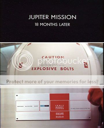
Futura extensively in every film he made after
Lolita (except
Barry Lyndon, a period piece). I was always curious about this, and now I have some clarity on the issue. From
The Guardian":
As I walk in, I notice something pinned to his letterbox. "POSTMAN," it reads. "Please put all mail in the white box under the colonnade across the courtyard to your right."It is not a remarkable note except for one thing. The typeface Tony used to print it is exactly the same typeface Kubrick used for the posters and title sequences of Eyes Wide Shut and 2001. "It's Futura Extra Bold," explains Tony. "It was Stanley's favourite typeface. It's sans serif. He liked Helvetica and Univers, too. Clean and elegant.""Is this the kind of thing you and Kubrick used to discuss?" I ask."God, yes," says Tony. "Sometimes late into the night. I was always trying to persuade him to turn away from them. But he was wedded to his sans serifs."Tony goes to his bookshelf and brings down a number of volumes full of examples of typefaces, the kind of volumes he and Kubrick used to study, and he shows them to me. "I did once get him to admit the beauty of Bembo," he adds, "a serif.""So is that note to the postman a sort of private tribute from you to Kubrick?" I ask."Yeah," says Tony. He smiles to himself. "Yeah, yeah."For a moment I also smile at the unlikely image of the two men discussing the relative merits of typefaces late into the night, but then I remember the first time I saw the trailer for Eyes Wide Shut, the way the words "CRUISE, KIDMAN, KUBRICK" flashed dramatically on to the screen in large red, yellow and white colours, to the song Baby Did A Bad Bad Thing. Had the words not been in Futura Extra Bold, I realise now, they wouldn't have sent such a chill up the spine. Kubrick and Tony obviously became, at some point during their relationship, tireless amateur sleuths, wanting to amass and consume and understand all information. Tony obviously misses Kubrick terribly. »The is also a surprising piece about Kubrick's hobby -- stationery!"I was just talking to Tony about typefaces," I say to Jan.
"Ah yes," says Jan. "Stanley loved typefaces." Jan pauses. "I tell you what else he loved.""What?" I ask."Stationery," says Jan.I glance over at the boxes full of letters from people who felt about Kubrick the way Kubrick felt about stationery, and then back to Jan. "His great hobby was stationery," he says. "One time a package arrived with 100 bottles of brown ink. I said to Stanley, 'What are you going to do with all that ink?' He said, 'I was told they were going to discontinue the line, so I bought all the remaining bottles in existence.' Stanley had a tremendous amount of ink." Jan pauses. "He loved stationery, pads, everything like that." Fascinating stuff. Read more
here.

 I know this list is really, really heavy on Pop's twin 1977 masterpieces The Idiot and Lust For Life, but I LOVE those two records so deeply, it's hard for me to put anything above them. Nobody in all of popular culture has stradled high and lowbrow art like Iggy - and those two albums represent that.

